What: Art Therapy helps those who cannot express themselves to do so in the way of art and is intended to be therapeutic.
Where: Art Therapy is most prevalent with people in need of any medical care whether it be the elderly, young children, children with special needs, adults with special needs. There are many uses for Art Therapy.
When: Art Therapy came about as a profession in the mid twentieth century (1940's).
How: An artist named Adrian Hill realized the benefits of some types of art such as painting and drawing when he had tuberculosis.
Sunday, December 2, 2012
Art Nouveau:
-elegant
-feminine
-curvy
Bauhaus:
-curvy
-linear
-bold
-brings the art together
-pops out at you
-bold
-Not very balanced
-lots of red, white, and black
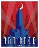
Art Deco:
-Geometrical
-colorful
-solid colors
-graphic look
International Typographic Style:
-textual
-plays with negative space
Modernism:
-futuristic
-plays with shape
-flowing design
Post-Modernism:
-emphasis on alignment
-plays with line
Wednesday, November 7, 2012
Monday, October 29, 2012
Monday, October 22, 2012
Wednesday, October 3, 2012
Form & Content Essay
For my final design, i started out by bringing in a grid of thirds and then I broke up the space by typing boxes of the word repetition. I copied the original box and spread it around the page. In order for it all to not look so uniform, I took out a few lines from the boxes and spread those around too. For emphasis I put it on the right side of the page with the 'E' enlarged more than the rest of the word to make it stand out. After emphasis your eye goes over to balance which in put the 'ba' on top of 'la' and 'nce' on the bottom to show the meaning of balance. From balance your eye goes over to contrast. I made a copy of contrast and flipped it to make it look like a reflection. I changed the color on the top contrast to a dark blue color and left the bottom contrast black. Alignment is placed at the top off center to the left. The direction of the word reads down to the letter 'm' then the rest of the word reads to the right. Flow is in the bottom left corner in light blue. The way the words are placed and made on the page lead your eye around the page so you are not focusing on just one point the entire time you look at it. When you look at the piece your eye should go from emphasis, to balance, to contrast, alignment, flow, and then you really see what the boxes in the background say which is repetition. All the words within the piece line up with another or the grid. Emphasis actually sits on the right 'line' when you daw out the rulers in photoshop. 'Ment' lines up with the 'p' in emphasis. The negative space i left with the design also helps to move your eye around the piece because it has broken up the space.
Wednesday, September 26, 2012
Subscribe to:
Comments (Atom)


